What Color Series Is

Color Series is a design-led project focused on studying color, light, and small visual details.
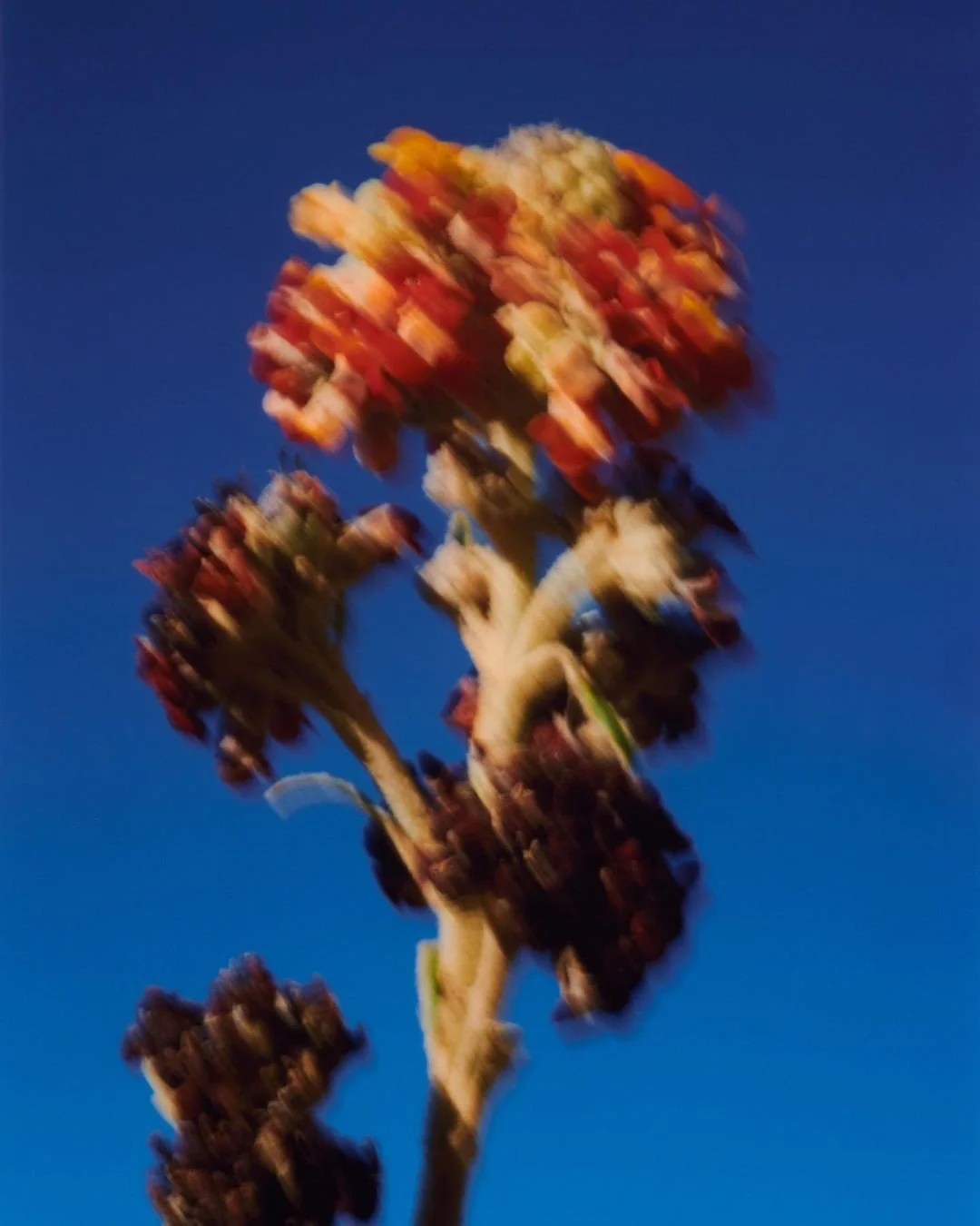
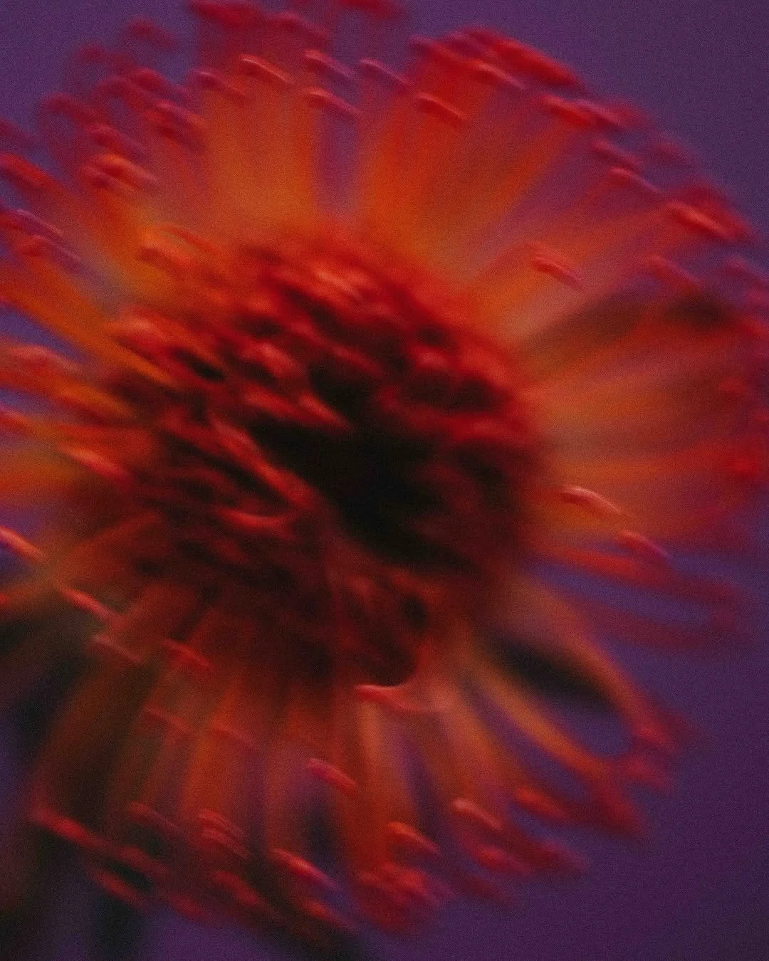
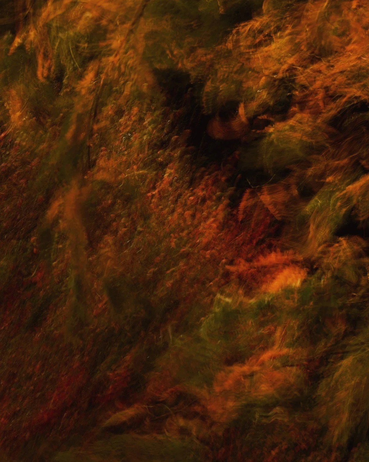
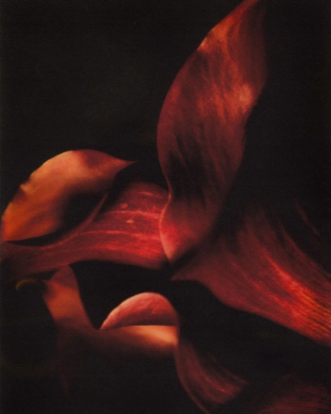
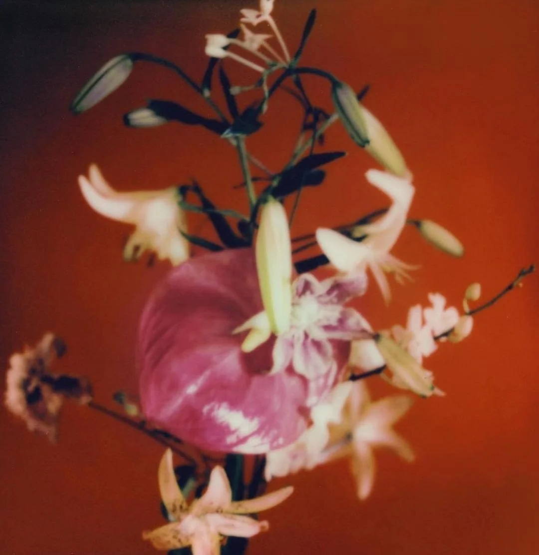
Each Palette Issue is a structured collection built from real environments, everyday moments, and subtle changes in atmosphere.
The goal is to present color in a clear, intentional way that feels honest and grounded.
Why the Series Exists
The series was created to simplify how people connect with visual design.
Instead of overwhelming compositions, each issue focuses on a minimal set of gradients and tones.
This approach allows the viewer to form their own perception and their own meaning without distraction.
What Defines Each Issue
Every Palette Issue follows the same principles:
Observation: Noticing details that are often ignored.
Color Accuracy: Building palettes from real light, real texture, and true-to-life moments.
Controlled Simplicity: Keeping compositions minimal so color remains the focus.
Emotional Clarity: Allowing the viewer to decide how the palette makes them feel.
Consistency: Each issue has its own identity, but all follow the same creative standards.
How Each Collection Is Created
The process stays consistent across issues:
Capture
Documenting environments, textures, and natural light that influence the palette.Select
Identifying the most relevant visual cues: tone shifts, gradients, subtle movements.Build
Developing gradients that match the atmosphere observed in real moments.Refine
Adjusting color balance, contrast, and depth to maintain a controlled and minimal aesthetic.Release
Presenting each palette as part of a structured issue with a clear identity.
The work isn’t based on trends or decorative design.
Each issue is a study - consistent, intentional, and focused.
This creates collections that feel long-lasting, adaptable, and relevant in different environments.
What Makes Color Series Different
What the Collections Offer
Color Series provides:
Minimal gradient compositions
Color-focused artwork designed for real spaces
A consistent visual system across issues
A clear identity for each collection
A simple way to bring design into everyday environments
Palette Issue 001 established the foundation: calm gradients, atmosphere-focused color, and a simple visual language.
Palette Issue 002 expands on the system by focusing more on small details, texture, and the impact of paying attention to overlooked moments.
Together, they define what Color Series stands for: clarity, subtlety, and design built from real-world observation.
How Palette Issue 001 and 002 Shape the Direction


The Ongoing Vision
Color Series will continue introducing new issues, each exploring a different aspect of color and environment.
The structure stays the same, but the perspective shifts with every release.
The long-term goal is to create a catalog of studies that evolve while remaining consistent and intentional.